Are you looking for ways to increase your eCommerce sales?
OK, this is a bit of a loaded question, because who doesn’t want more sales? The real question here is how you can boost sales. The answer lies in the digital shelf.
What Is a Digital Shelf?
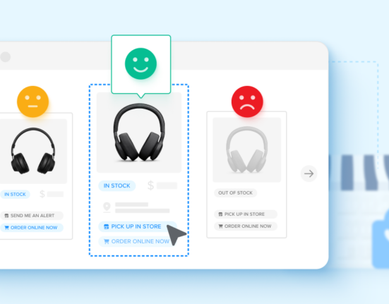
Let’s dive right in: what are we talking about when we say “digital shelf”? The digital shelf is your online storefront. It’s where your sales convert on your website or where you advertise products that can only be purchased via a brick-and-mortar retailer. Many professionals refer to it as a product display page, or PDP.
Just like a physical shelf, the digital version is the place where you educate the potential buyer on the benefits of your product, share important product details (like prices), and close the sale. Of course, not all digital shelves are created equal. Some are better than others at achieving your sales goals. What do those so-called “perfect” digital shelves look like?
A digital shelf is a web page where you convert sales or advertise products, also known as your product display pages.
Examples of a Perfect Digital Shelf
To understand what goes into a perfect digital shelf, it helps to start with some common elements you’ll find on these web pages.
For starters, the shelf is broken into two main sections: above the fold and below the fold. These are newspaper terms, where the most interesting, exciting, and eye-grabbing information was placed “above the fold” of the paper to capture readers’ attention, while the additional detail was “below the fold.” The same concept applies here.
Put the good stuff at the very top of the page, before site visitors have to scroll, then supplement that content with more information below. Here’s a breakdown of what to include above the fold and below the fold.
Above the Fold
Like we said, this where the most important information about your product must live on the digital shelf. Think of it like the eye-level placement on a physical shelf.
Product Images
Prominently displayed on this page is a picture of the product. A lack of imagery here is a telltale sign that the page falls short of a “perfect” descriptor. Shoppers need to see the product in question. In addition, the images need to be clear and high-quality. Better yet, offer a gallery or carousel of images so the web visitor can scroll through multiple angles or variants.
Product Description
Switching to the text, another above-the-fold must-have is a good product description. Space is at a premium here, so many brands and retailers write a short description—usually two to three sentences—that convey the use, purpose, and differentiators of the product. Like with the images, the product description needs to be clear and concise.
Price (Minus Shipping)
The third item to absolutely include above the fold is the product’s price, minus any shipping costs. As we all know, price is one of the most important considerations in whether a shopper will buy from you, and the online space means pricing is wildly competitive and subject to frequent repricing. Therefore, get your price front and center for all to see. For shipping costs, you can save that for the checkout process, as it’s expected that an eCommerce seller will have multiple shipping options to toggle toward the end.
Could Go Above or Below
The next few items could end up above or below the fold. How can you tell? This depends on:
- How many details you need to share and how much space on the page you have to play with.
- Your category and how many variants of the product are for sale (apparel and perishables have a different set of product details that can be important, for example).
- Whether you are using the digital shelf for eCommerce or not. Not all web pages are set up for eCommerce, as the product might be too custom, large, or perishable to sell online.
Here’s what can go above or below, depending on your needs.
Star Ratings
Is your product rated 4.5 out of 5 stars? You might want that information at the very top of the product display page. Perhaps your product isn’t in a category that lends itself well to star ratings. In that case, you might not include one at all or move it below the fold to prioritize other information.
Unit of Measure
How much does your product weigh? Is this SKU a multi-pack? Is it clothing, with a specific size? Depending on your answers to these questions, you might want this information above the fold or below. Some items, like clothes, really need sizing at the top. Others, like a dining room chair, might be better served by having its full dimensions explained below in a handy chart.
Badging
Is your product a top-seller? Is it certified as a sustainable good? Did you get reviewed and recommended by a third party? In any of these cases, you can likely get a badge to display on your digital shelf. These badges are great marketing tools to capture attention and motivate shoppers to buy. In these cases, it can go above the fold. Or, perhaps badges are less important in your category, but still relevant enough to want on the page. Then, you can create a section for them below the fold.
Below the Fold
Finally, the rest of the web page—once users have to scroll down to see it—can include a variety of information either too long or not important enough to get placement above the fold.
That can include the following items.
Testimonials and Reviews
Below the fold can be a good place to include any longer reviews or testimonials from users, especially if you’ve including a star rating at the top. These reviews are often longer, taking up more space that is at a premium above the fold. Many sites, like Amazon, have entire sections dedicated to reviews where visitors can scroll through feedback about the product.
Directions or Warnings
This part of the product display page is also a great place for longer product descriptions, including directions on how to use the item. You can have the short elevator pitch up top and a full overview down here. In addition, this might also be the right place for warnings, like what you’d see on over-the-counter medicine.
Specifications or Ingredients
Lastly, your category might require that you include specifications for the product (like the aforementioned dining room chair example) or a list of ingredients if it’s a food or beverage. Below the fold is where you have much more space to explain all of these elements in detail to better educate your shoppers. You might also want to include charts, graphs, or other images to best describe your product.

Why Creating a Perfect Digital Shelf Is Important
All of this information around a digital shelf might be leading you to another question: Why is creating a perfect digital shelf worth your time?
The short answer is because it will lead to more sales. The longer answer is because it is a representation of your brand and your product. It is a reflection of what makes you different from your competitor and it creates a seamless, easy experience for the customer. Ideally, the online shelf is consistent with the in-store shelf, in the sense that your brand comes across positively in both.
A winning digital shelf can also move products off the physical one. Many consumers use the web to browse and educate, then use the brick-and-mortar store to feel and test. The right balance of information online can improve in-store sales. The ease of finding competitor listings makes it worth your time as well, as customers can quickly toggle over to another site for a comparison. You want to stand out for the right reasons.
How to Optimize Your Digital Shelf
By now, we’ve defined the digital shelf and we’ve explored a little about why it’s an important part of your eCommerce selling strategy. Now, it’s time to talk about what we can do to optimize it.
The most important part of digital shelf optimization is a mobile-friendly, responsive design. What does this mean? When a customer pulls up your site on his or her phone, the web design automatically translates for the size of the screen. There are no wonky elements or long loading times. Most eCommerce shoppers are using their phones, so you should instruct your web designer to design for mobile first, desktop second.
Second, you need an easy way for users to switch between product variants. It’s unrealistic and ineffective to have multiple web pages for each version of a product (like different colored or sized t-shirts). Instead, you need a toggle feature where visitors can swap sizes and colors right on the same page. This is what an optimized digital shelf looks like. A page where choosing “medium” instead of “large” opens a new window is decidedly not.
Finally, your product display page needs to be written and designed for the end-user. Put yourself in their shoes. What questions are they asking about your brand, store, or product? Does the digital shelf answer those questions? If not, you are not optimized.
The concept of answering a searcher’s queries is central to search engine optimization and best-practice web content, and the idea remains true for eCommerce. The best pages are the ones that are written for the reader, not for your business. Make sure the information is valuable, relevant, and updated. Don’t waste their time or mislead.
Support Your Team With the Right Tools
What comes next? This all might feel like a lot of information, as you look to create a good consumer experience and design effective digital shelves. The starting point can be simple—read through your product display pages. Think about what the shopper wants to see. Does your website serve up that information in a clear, concise way?
If yes, you’re on your way to an optimized strategy. If no, you can look at the above elements of a perfect shelf for ideas on how to improve. You can also look for the right tools to support your team. There’s plenty of digital shelf software on the market. At Wiser Solutions, our focus is around market intelligence, price intelligence, and commerce execution. We’ll help you better understand the competitive landscape, your brand positioning, and your pricing strategies, so you can build your digital shelf with the best details to convert.


