Introduction
The concept of the Perfect Store has become a strategic cornerstone for leading brands striving to achieve seamless execution across online and in-store channels. By unifying compliance processes and leveraging actionable insights, they achieve measurable improvements in brand representation, customer experience, and sales outcomes. A premium global durables manufacturer has partnered with Wiser to achieve just that, demonstrating how the Perfect Store framework can elevate the omnichannel experience and strengthen retail partnerships across channels and markets.
The Perfect Store in Action
This brand faced a significant challenge: ensuring their resellers upheld their high standards of execution, reflecting their premium image both online and in-store. They had relied on disparate systems, including a third-party online compliance tool and various regional auditing providers for in-store execution. This resulted in fragmented data, delays, and missed opportunities to enforce brand standards consistently.
Here’s how they used the Perfect Store framework to transform their approach:
1. Establishing the Metrics That Define the Perfect Store
The foundation of a Perfect Store strategy is defining the right metrics that reflect brand standards and consumer expectations. For this brand, these metrics span both online and in-store environments, ensuring a consistent and premium experience wherever the customer engages with their products.
Key metrics include:
- Display Quality
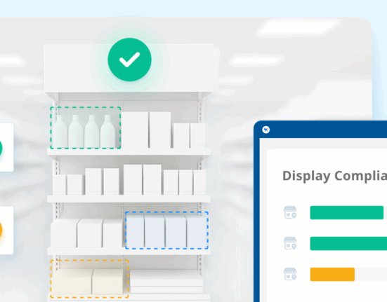
- In-store measurements could include verification that displays were positioned in high-traffic areas, at optimal heights, and presented alongside price tags and clean, damage-free visuals.
- Online measurements may include verification that product images, descriptions, and pricing are accurate, consistent, and compliant with brand guidelines.
- Stock Availability
- In-store, this may look like monitoring shelf-level stock to ensure products are available for purchase and not out-of-stock or misplaced.
- Online, it could look like capturing data on inventory levels displayed on retailer websites to prevent “out of stock” messages.
- Demo Product Functionality
- In-store, this could mean ensuring demo units are operational, providing customers with a hands-on experience that reflects the brand’s premium quality.
- Online, this could mean highlighting interactive features like 360-degree product views or video demos.
Establishing these metrics is the first step to aligning every touchpoint with brand standards, setting the foundation for consistent execution across all channels.
2. Measurement – Unified Data Collection with Wiser
Capturing and measuring metrics across both online and in-store channels is complex, especially for brands operating globally. Often, brands must rely on separate providers for online and in-store data collection, resulting in inefficiencies, fragmented insights, and delayed reporting.
Wiser can address this challenge by providing a single, unified solution to collect and track Perfect Store metrics.
In-Store Audits:
Using Wiser’s global crowd, in-store audits capture detailed information on display quality, demo functionality, and product placement. These audits are consistent across markets, providing comparable data regardless of location.
Online Monitoring:
Wiser’s online tools automate the process of scraping retailer websites, capturing real-time data on product presentation, pricing, and availability. This eliminates the need for manual checks and ensures accuracy across all digital touchpoints.
By consolidating both in-store and online data collection under one provider, this brand gained operational efficiencies and the ability to act on insights faster.
3. Real-Time Reporting and Insights – The Wiser Advantage
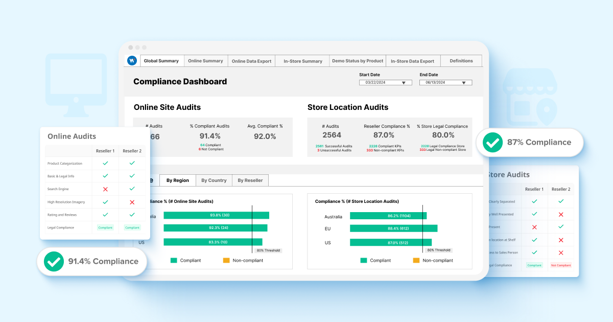
Data collection is only valuable if it can be transformed into actionable insights. Wiser’s comprehensive reporting tools integrate online and in-store metrics into a single, real-time dashboard, providing a holistic view of execution.
Here’s how Wiser empowers this brand with actionable insights:
Unified Reporting Across Markets and Channels:
Wiser’s dashboard enables comparison of compliance metrics across countries and sales channels. For example, the brand can now see how European sellers are performing relative to North American partners or compare in-store execution with online compliance within the same region.
Real-Time Visibility:
Issues like broken displays, missing demo units, or inaccurate online pricing are flagged immediately, allowing corrective actions before it impacts sales.
Correlation with Sales Performance:
The brand can now trend compliance data over time and correlate it with sales performance. For example, higher compliance rates in specific markets have been linked to increased sales of flagship products.
Performance-Based Partnerships:
Wiser’s score carding feature allows the brand to assess reseller performance objectively. Top-performing partners are rewarded with access to new product launches or exclusive promotions, creating incentives for continued excellence.
By consolidating data collection, analysis, and reporting into one platform, Wiser eliminates the inefficiencies of siloed systems and provides a clear path to executional excellence.
4. Improved Partnerships
For this brand, a custom scoring system was developed to assess seller performance. Those meeting or exceeding Perfect Store standards are rewarded with benefits like early access to new product launches or additional promotional support. An incentivized system can not only drive higher compliance rates but also foster stronger alignment with retail partners.
The Impact
This approach delivers tangible benefits:
Improved Compliance Rates:
Compliance across both online and in-store channels improved significantly, ensuring customers experienced consistent brand representation.
Operational Efficiency:
The integration of data into a single platform eliminated manual processes and reduced reporting delays.
Sales Growth:
By linking compliance performance to sales data, this brand can demonstrate a clear correlation between high execution standards and increased revenue.
For example, for one country alone, the brand’s Perfect Store implementation identified a business impact of €12.8M in store-level sales, underscoring the value of consistent execution.
Best Practices for Perfect Store Implementation
To achieve similar results, brands should:
- Define compliance metrics that align with their unique brand standards and customer expectations.
- Implement technology that integrates online and in-store compliance into a unified platform.
- Use data to guide partnerships, like rewarding sellers for strong performance and supporting those who need improvement.
- Continuously evaluate and refine execution based on real-time insights.
A Global Approach to the Perfect Store
One of the most impactful aspects of Wiser’s solution is its scalability. The brand can apply the Perfect Store framework consistently across diverse markets, from Europe to North America. This ensures that their premium standards are upheld globally, strengthening their brand presence and building trust with retail partners.
Conclusion
The Perfect Store is more than just a concept—it’s a powerful framework for driving omnichannel success. With Wiser’s unified solution, brands can define and measure the metrics that matter, seamlessly collect data across channels, and generate actionable insights to optimize execution.
For this premium durables brand, this approach elevates their retail execution, improves customer experiences, and drives sales growth, helping them position themselves as leaders in their category. By embracing the Perfect Store framework and leveraging Wiser as a partner, similar brands are setting the standard for excellence in retail execution, ensuring their brand thrives across all channels and markets.
Take the First Step Toward Omnichannel Excellence
Ready to elevate your execution strategy? Learn how Wiser can help you implement the Perfect Store framework and drive success across your retail channels.
Need to learn more? Watch this video on how brands and retailers are gaining a competitive edge with omnichannel strategy: Win the Moment Shoppers Choose to Buy
