In the restaurant business, they say that “People eat with their eyes first.”
That means that even if the food is cooked perfectly and is delicious, a bad presentation can put someone off before they even try it.
Retailers and brands are facing the same challenges. You might have the best products or prices on the market, but if your stores are bland or the products are poorly displayed, people will look elsewhere. This is where visual merchandising comes into play.
What is Visual Merchandising?
Visual merchandising is the practice of designing and displaying merchandise in a retail setting with the goal of engaging shoppers and boosting sales. This is done by creating displays that accentuate a product’s appearance, features, benefits, and uses in a visually compelling way.
Generally speaking, larger companies have merchandisers that are able to work closely with retail marketing teams to create displays that fit in with brand’s overall image and goals. Independent retailers have control over their own displays and can create them without the constraints of a brand’s guidelines.
The key point is that visual merchandising isn’t just about making products look good. It’s about presenting them in a way that drives tangible increases in revenue.
We tend to think about visual merchandising in terms of how products are displayed in a store via window displays, mannequins, signage, interactive experiences, etc. That’s certainly true, but with the rise of omnichannel retail, strong visual merchandising must also extend to online channels.
Visual merchandising is the practice of designing and displaying merchandise in a retail setting with the goal of engaging shoppers and boosting sales.
The Importance of Strong Visual Merchandising
Visual merchandising is a powerful way to cut through the noise. In brick-and-mortar stores and online storefronts, consumers are barraged with visual and text-based advertising. When there are so many products shouting “Look at me!”, it’s easy for shoppers to feel overwhelmed and overlook the majority of them. It’s simpler for them to keep their heads down and quickly locate the product they came in for.
The purpose of visual merchandising is to draw in and engage customers, so that they might make purchases.
For the visual merchandiser, the job is very much a matter of starting with the architecture of the entire retail space, whether it’s a store, a website, or a mobile app.
Once this has been determined, the ultimate role of the visual merchandiser is to design spaces that combine the unique selling points of the individual products and the overall brand aesthetic in a way that communicates the value of each item and the brand as a whole. It’s about orienting the customer experience across all channels in a way that conveys what you want your customers to know about your products and brand without relying on large amounts of text.
We’re all familiar with the classic “AIDA Model” sales funnel: Attention, Interest, Decision, Action. Visual merchandising lives at the top of this funnel. It should get attention, provoke interest, and lead otherwise passive browsers deeper into the decision process.
Consider the alternative: Every product is displayed side-by-side with little to distinguish them from one another. The layout of the store says nothing about the brand and makes no effort to draw the shopper in to learn more. Doesn’t sound like a smart strategy, does it?
Types of Visual Merchandising
Most brands and retailers have some degree of visual merchandising already. But if you’re looking to improve yours, how can you start applying different merchandising techniques to your point-of-sale locations?
In this section, we’ll consider a few types of visual merchandising and how they can be used. Consider which ones you’re already making use of and which ones you can add to your mix to tell your product and brand story in a different way.
Interactive Displays
Touchscreen technologies are a great way to draw people into a specific display to learn more about a specific product or a product line. These can take the form of a “choose your own adventure” game or even incorporate virtual/augmented reality.
Fashion retailers like Rebecca Minkoff are using these technologies in-store, while home goods retailers like Wayfair have a mobile AR app that lets you choose designs and see how they look in your space in real-time.
Of course, interactivity doesn’t only have to come from high-tech solutions. For example, field marketing is a great way to show, instead of tell, what you’re about in a way that includes the customer. This could be as simple as letting customers try products out and asking them to provide feedback.
Window Displays
The first impression you make on a customer can be a major advantage for your brand if you nail it. A window display that catches a shopper’s eye and wins their interest as they are walking into a retail space can get them to look deeper into your offering.
Window displays are endlessly flexible and can be used in many different ways to convey valuable messaging about new products and promotions.
Mannequins
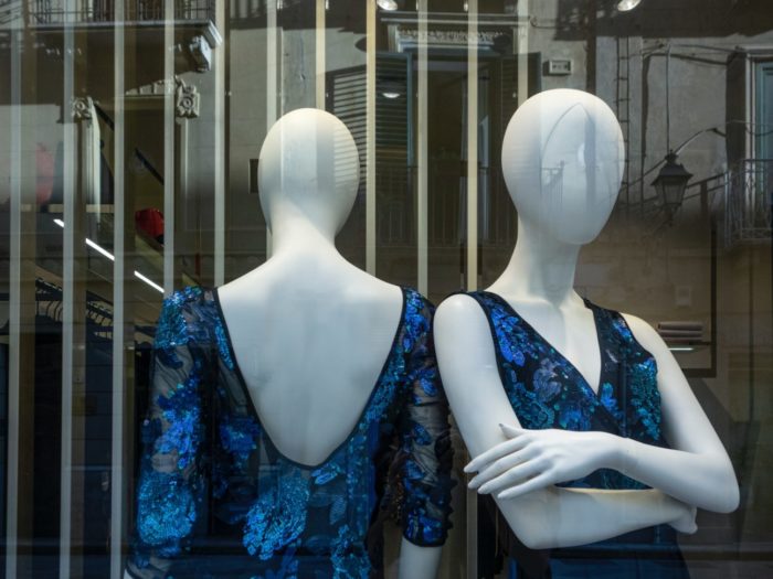
Mannequins are a staple of nearly every apparel retail store and for good reason. They allow customers to see what clothes look like on a person without forcing everyone to try things on. But just because they’ve been around a while doesn’t mean they’re out of style.
Clever visual merchandisers pose mannequins in interesting and unexpected ways to draw attention and break the status quo of otherwise passive shoppers. In recent years, retailers have begun using mannequins that represent a wider audience, such as disabled or plus-sized people. This inclusivity has a further reach, and can sometimes impact shoppers emotionally, leading to more sales and likely improving customer relationships with those being represented.
And for the non-apparel retailers: How can you use mannequins to play with your customers’ expectations? Imagine walking into an electronics or home goods store to see mannequins demonstrating the products.
Signage
Simple, but effective. Signage is a time-tested technique for conveying a lot of information in a digestible, eye-catching way. It can be as simple as a poster showing a great deal, or as complex as a digital sign that entertains and informs. Just like with window displays and mannequins, signage is a simple tool that is adaptable for any kind of messaging.
How to do Visual Merchandising Effectively
The specific techniques you use for visual merchandising are important, but it’s crucial not to lose sight of your overall merchandising strategy. Here are some tips for using visual merchandising effectively.
Understand Your Customer Deeply
Creating effective visual merchandising isn’t just a matter of creating a compelling visual brand and making eye-catching displays. How you present your products must also be informed by what is important to your customers.
Make sure you are merchandising the products that your customers want, not what they need.
Shoppers will always come into a store to purchase merchandise that they can’t live without. So, there’s no need to advertise this to them. Instead, seize this opportunity to draw shoppers toward other products they wouldn’t have seen otherwise.
Are your customers looking for great value via low prices? Are they looking for the feeling of luxury and differentiation? Are they trying to stay on the cutting edge of the latest fashion trends?
Your merchandising strategy should take all of this into account when planning the visual display of your stores and digital channels.
Tell a Story
Customers make near-instantaneous decisions about whether to look closely at something or keep walking/scrolling. That’s why it’s crucial to tell a story that starts with a hook. Once interest is established, show them what they get when they purchase something.
Get creative and think of how you can appeal to more than just your customers’ senses of sight. Is there a way to use sound, touch, smell, or even taste to create a multi-dimensional experience?
Consider including graphics that help customers associate their own lives with your products. For example, if your product is a blender, you might show a scene of a parent blending smoothies in the kitchen with their kids. Visuals like this can evoke an emotional connection in the shopper, making them more likely to purchase.
You must constantly audit your stores to understand where your merchandising is effective and where it isn’t, so you can continuously grow and change your strategies.
You must constantly audit your stores to understand where your merchandising is effective and where it isn’t.
Consider Lighting, Color, Height, and Mood
Speaking of the senses, it’s important to use store design and visual merchandising to set a mood.
Lighting can direct shoppers’ eyes to where you want them to look. Vibrant colors set against a neutral background can be a magnet for people whose curiosity is piqued. It’s important that you create a focal point for your shoppers to lock in on. Where do customer’s eyes go when they first see your display? Are they confused about where to look?
Make sure to consider your display from a shopper’s perspective. It’s important that all potential customers are able to view them as you mean for them to, whether they be short or tall.
An interactive display can talk about something interesting that makes people stop and listen. Even the kind of music you play in your stores says something about the merchandise and the brand.
Find Opportunities to Cross-Merchandise
What products do you have that complement each other? Placing them together in a display primes customers to purchase them together and increase overall basket size.
Grocery stores are the most obvious example of this principle in action. Condiments are always near the bread, except for salsa, which is near the tortilla chips of course.
But most other retailers use this same principle of product bundling. Electronics retailers have Blu-ray movies next to the Blu-ray players. Smartwatches are near the smartwatch bands, etc.
Using retail intelligence to understand which products are often bought together and for which prices can give you an edge here.

Constantly Audit Your Points-of-Sale
Visual merchandising isn’t a “set it and forget it” task. You must constantly audit your stores to understand where your merchandising is effective and where it isn’t. The architecture of your stores and digital platforms, as well as the individual displays, is fundamentally a creative undertaking. But it must be data-driven and constantly iterated upon for all of it to stay effective.
Beyond that, customers can get display blindness if they’re used to seeing the same old displays every time they walk into a store. Constantly mixing up your visual merchandising strategy and trying new things not only allows you to collect valuable data, but it keeps things fresh for customers.
Visual merchandising is a wide-ranging discipline that involves marketing, operations, design, and sales to create a compelling customer experience and drive sales. Understanding how to use data to fuel the creative aspects of it can be a true differentiator in a crowded retail field.
Creativity Is the Most Important Element of Visual Merchandising
In the end, all brands are trying to create the best displays they can. The best way to stay ahead of the crowd is to change up your displays regularly and be creative with your designs.
There is both an art and a science to creating popular stand-out visual displays and achieving this will take trial and error.
Take the time to understand your audience, define your company goals, and translate this into your visual merchandising designs. Ultimately, your strategy needs to be the right one for you.
Editor’s Note: Contributing writer is Alexandria Flores. This post was originally published in May 2020 and has since been updated and refreshed for readability and accuracy.


